Context

The Disability Resources for Students (DRS) at the University of Washington (UW) and I collaborated together to create a newly updated and accessible website for all students, focusing on students with disabilities, which include vision, dexterity, and other limitations, who use assistive technology and are in need of accessible resources.
I designed and coded a new website for UW Disability Resources for Students (DRS) to provide UW students with disabilities easy access to online resources and support their academic success.
This section will focus on the Academic Skills page, but the FULL DRS website is still in the process of being built and is NOT currently live.
Note Analysis
My Role and Responsibilities
Graphic Design
Icon Design
UX/UI Design
Digital Media/ Web Design
Challenge
The previous website presented significant barriers, which necessitated a complete overhaul:
1. Legal & Ethical Imperative (ADA/WCAG Non-Compliance)
Problem: The previous site likely failed to meet key WCAG (Web Content Accessibility Guidelines) standards (A, AA, or AAA), putting the UW at risk of non-compliance with the ADA (Americans with Disabilities Act). Non-compliance creates legal risk and an ethical failure to serve all students equally.
Design Rationale: A compliant design is not a bonus; it's a foundational requirement for a public-facing university resource.
2. Cognitive Overload and Poor UX
Problem: Being "too text-heavy" is a critical UX failure. It causes cognitive overload, making it difficult for all students, especially those with cognitive or learning disabilities (e.g., ADHD, Dyslexia), to find essential information quickly. Dense text also discourages engagement.
Design Rationale: I recognized that simplicity is a form of accessibility. Reorganizing content with clear information architecture (IA), using plain language, and employing visual hierarchy improves the experience for everyone (the principle of Universal Design).
3. Failure for Assistive Technology Users
Problem: Inaccessible graphics, poor color contrast, and lack of proper code structure (e.g., heading tags, ARIA roles, link text) render the site unusable for people who rely on assistive technology (AT), such as:
Screen Readers (Vision): They cannot interpret complex, untagged infographics or images without proper alt-text.
Keyboard Navigation (Dexterity/Vision): Users who cannot use a mouse must be able to tab through all interactive elements in a logical order.
Design Rationale: I prioritized code quality and semantic HTML as much as UW’s WordPress would allow, to ensure the site's structure is fully machine-readable
Design Question
How might we improve the accessibility of UW’s online learning systems to support students with diverse disabilities?
Improve Information Architecture
The initial Information Architecture (IA) suffered from low findability due to its shallow structure and ambiguous page titles, hindering effective user navigation.
My approach was to conduct a content audit and restructure the IA using a user-centered design methodology, focusing on two critical improvements:
Logical Organization: I applied card sorting principles to group related content into distinct, high-level categories. This created clearer content pathways and established a predictable hierarchy, which is essential for mental modeling.
Descriptive Labeling: I revised page titles to be descriptive and distinct. This ensures that each title acts as an effective signpost, immediately conveying the content's purpose and improving the clarity of breadcrumbs and navigation menus.
Original Information Architecture
New and Improved Information Architecture
Visual Elements
Strategic Rationale (The "Why"):
My focus was on utilizing visual communication design to solve common UX challenges, specifically:
Reducing Cognitive Load: By translating complex concepts and technical procedures into infographics, I reduced the need for users to process dense textual information. The visual hierarchy, color coding, and sequencing inherent in infographics make concepts more immediately digestible.
Enhancing Engagement and Delight: The integration of visually appealing and modern graphics (created using Adobe Creative Suite, Figma, and Procreate) elevates the site's aesthetic quality, contributing to a more delightful user experience and increasing perceived professionalism.
Design Principles (The "How"):
In the production process, I prioritized critical institutional and UX standards:
Brand Consistency: Strict adherence to the University of Washington's branding and style guidelines ensured all visual assets maintained institutional alignment and a cohesive look-and-feel across the digital ecosystem.
Inclusive Design: I ensured diversity, inclusion, and accessibility in every graphic. This involved careful consideration of color contrast, maintaining accessible font choices, ensuring adequate visual spacing, and providing robust alt-text descriptions for every non-decorative image, making the content usable for the widest possible audience.
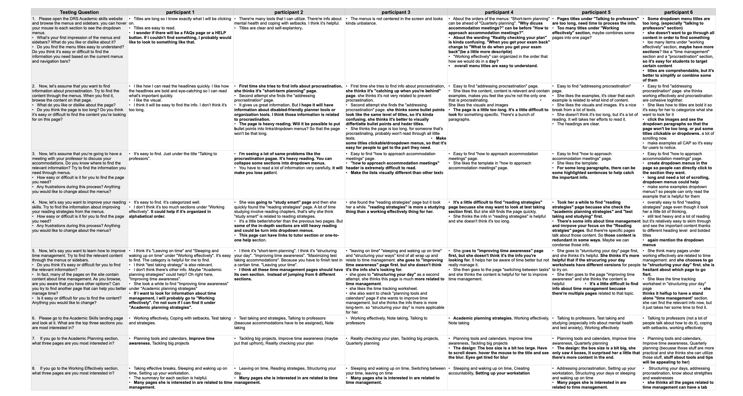
User Testing
I authored a detailed usability script to test the prototype with six students, specifically targeting those with diverse disabilities (without requiring disclosure of diagnoses). This deliberate focus on varied accessibility needs provided a more rigorous stress-test of the design's universal usability.
Objectives & UX Rationale
The two primary research questions were strategically chosen to address the core risks identified in the earlier phases:
1. Findability and Navigation Efficiency (Key UX Metric: Task Success Rate)
Question: Could the students find the information they need easily?
Critical Thinking: This objective directly measures the success of the revised Information Architecture (IA) and navigation system. The goal was to determine whether the new descriptive labeling and logical structure resulted in predictable pathways and a low cognitive load. Measuring Task Success Rate and Time on Task was crucial to determine if the design truly facilitated efficient self-service.
2. Content Density and Scannability (Key UX Metric: User Perception/Satisfaction)
Question: Was the website still too content-heavy?
Critical Thinking: While the IA addresses organization, this objective focuses on content design. Users with certain disabilities often rely on scannability (short paragraphs, strong headings, clear lists) to quickly parse information and avoid fatigue. High content density, even if well-organized, can overwhelm and act as a barrier to comprehension. This qualitative feedback would validate whether the visual design and content presentation were effective in breaking up text and promoting readability.
By framing the testing around these two points, I ensured that the results would yield actionable insights for the final design iteration, moving beyond simple preference to validate the core principles of an inclusive and efficient user experience.
Key Insights
Enhance Information Architecture for Better Usability by:
Streamline Content Organization and Labeling: Improve the structure and labeling of content to make it more intuitive and user-friendly.
Simplify Titles: Make titles more concise, clear, and action-oriented to enhance readability and navigation.
Optimize Banner for Accessibility: Update the banner design to ensure it meets accessibility standards (e.g., contrast, alt text, and responsive behavior).
Implement Accordion Menus: Use accordion menus to organize content into collapsible sections, improving readability and reducing clutter.
Refine Language: Reword content for clarity, consistency, and a more engaging user experience.
Solution
1. Information Architecture & Navigation
Solution: Conducted a content audit, restructured the Information Architecture (IA), and revised page titles to be descriptive, concise, and action-oriented.
Result (Smooth Navigation): Created a clear, predictable navigational hierarchy that significantly lowered the cognitive load, allowing users to find critical content quickly and efficiently.
2. Content Design & Accessibility
Solution: Implemented accordion menus on text-heavy pages to section content into digestible, collapsible units.
Result (Clear Content Layout): Directly improved scannability and focus. This layout is a crucial assistive feature for users with attention challenges (e.g., ADHD), as it minimizes visual clutter and allows for selective engagement with content.
3. Visual Communication & Engagement
Solution: Produced various accessible infographics and visuals using Adobe Creative Suite, Figma, and Procreate to simplify complex concepts and procedures.
Result (Enhanced Comprehension): Improved user engagement and comprehension by transforming dense text into visually accessible guides. All graphics strictly adhered to the University of Washington's branding and style guidelines, prioritizing diversity, inclusion, and contrast standards.
Validation & Impact
Usability Testing: Designed and executed a usability script with six students, specifically including participants with various disabilities, to stress-test the IA and content layout.
Key Findings: Testing confirmed the success of the revised IA and validated that the new content layout improved task success rates and user satisfaction, demonstrating a commitment to data-driven, inclusive design.

The full DRS site is still being updated and will go live soon, but the Academic Skills site is now available for preview.
Click the image below to go to the website!
Reflection
This project was a profound opportunity that solidified my commitment to inclusive design and the critical nature of WCAG compliance. The process highlighted key operational lessons and provided a clear vision for how I would further enhance accessibility with additional time and resources.
Working within the constraints of the DRS recruitment process underscored a critical lesson in UX design: testing must be integrated early and often, especially for specialized populations.
The Problem: The necessary reliance on DRS staff for recruitment significantly delayed the start of user testing. This pushed vital user feedback, especially on the information architecture (IA) and navigation, to a later stage.
The Impact: Implementing changes to the IA and navigation post-development resulted in a high effort cost. Adjusting numerous links and WordPress codes to reflect user-driven changes was a time-intensive, manual process.
Future Strategy: In hindsight, I would have strongly advocated for low-fidelity, concept-level testing (e.g., using card sorting or simple wireframes) with the initial student cohort before committing to code. This would have validated the core structure, saving substantial time and rework. Simple, early user testing is the most effective form of preventative maintenance in UX design.
Future Vision
With more time, an expanded budget for recruitment, and freedom from specific platform constraints (like UW WordPress), I would pursue the following high-impact accessibility and UX enhancements:
1. Robust, Longitudinal User Testing with Diverse AT Users
Goal: Move beyond a limited testing sample to conduct longitudinal studies (testing the same users over time) with a broader range of disabilities.
Action: Specifically recruit and observe students using diverse Assistive Technologies (AT), including:
Voice Control Software (e.g., Dragon NaturallySpeaking) to test forms and navigation for users with dexterity limitations.
Magnification Tools and screen readers (e.g., JAWS, NVDA) to fully audit the responsiveness and semantic integrity of complex interactive components.
Focus: Gaining this depth of insight would enable me to refine minor, yet critical, accessibility elements that often differentiate between WCAG AA and WCAG AAA compliance.
2. Building Custom, Accessible WordPress Components
Constraint: The current UW WordPress platform imposes limitations on the visual design and interactive elements, often requiring reliance on pre-built, and sometimes less-than-perfectly accessible, themes or plugins.
Action: With additional resources, I would want to develop custom, fully audited components (such as accessible image carousels, modals, and dynamic filters) from scratch. These custom components would be rigorously tested for ARIA compliance and keyboard operability to ensure they meet the highest standards, something often difficult to guarantee with third-party tools.
3. Proactive, Real-Time Accessibility Monitoring
Action: Implement a continuous accessibility auditing system using tools to scan the site automatically after every major content update. This shifts the process from a final QA step to a proactive maintenance cycle, ensuring the site never drifts out of compliance as new content is added by the DRS team.